Preface
One portal to rule them all
Context
El Puerto de Liverpool is Mexico’s largest department store and one of the world’s major retail entities with over 9 billion dollars annual revenue with more than 300 brick and mortar stores across the country. They sell products from all major global brands as well as local products from different vendors. Since 2020, their e-commerce business has more than tripled with the addition of Liverpool Marketplace, a way to connect sellers with customers directly through digital channels.
The problem
With its rapid growth, the systems needed for running the operations became entangled. At one time, a supplier needed to log in to at least six different platforms to manage their day to day business. On the other side, administrators needed to keep tabs on the whole process with different access points to every platform and tool such as PIM, SAP, Billing, Logistics, Orders, Cataloguing and many others.
Role: Product designer / UX Strategist
Tools: Figma, Figjam, Miro
Time frame:
Inicial prototype in 1 month.
Project completion: 2 years
Methodology:
Design Thinking, Atomic Research, Agile development
The solution
And thus, “Entrada Única” (Single entry) was born. This ambitious initiative aims to unify different workflows into a seamless experience, and most importantly, under a single sign in and profile for every tool that suppliers, vendors, administrators and business executives need to run their businesses. It has taken a long time. We began in 2022 and are already 80% done migrating different portals and unifying experiences across the board into a seamless workflow. But results have begun to show. More than 22 million dollars saved on third party licenses over 5 years, 17,000+ users per month and a reported 65% NPS increase in users. ¿How was this achieved?
Chapter one
Cataloging
This story begins in 2022 when the business realized they have a big problem. Suppliers and vendors have 7 different entry points to catalog products that overlap and no clear path. I was given a month to prototype a possible solution of a single catalog entry point.
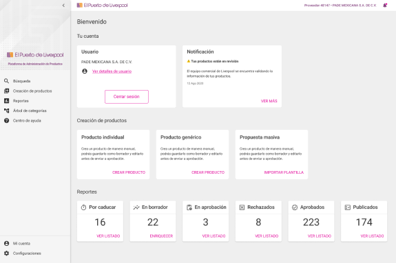
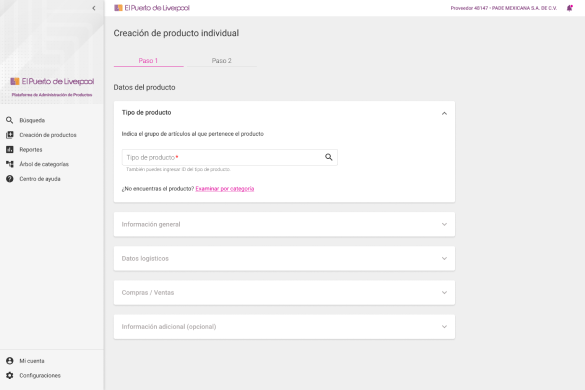
Existing solution
Research
I asked for as many contacts of vendors, suppliers, KAMs and everyone involved in the process of cataloging to understand from start to finish how the process of cataloging a product worked and what were the pain points and frustrations of users. At this point in time the team consisted of me and another coworker as a design pair. It was clear that a design-thinking approach was going to be the way forward and we opted for a atomic research methodology to get our insights. We had more than 10 hours of thorough interviews with users that we distilled like this:

We started collecting general comments, thoughts, rants and ideas from users. We then proceeded to group similar comments into a broad group or idea:
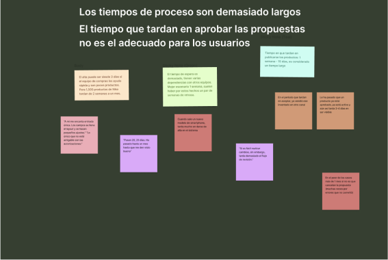
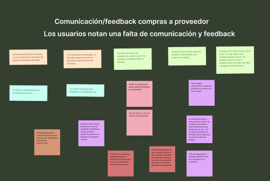
Finally we got our main insights:
- Lack of clear feedback regarding user inputs and mistakes.
- Too much time between sending a proposal and receiving a response.
Onboarding is not up to standard. - Image uploads take too long and it is complicated.
- Liverpool has a non standard format of images that takes them too long to create.
- Too many similar product categories.
- Too many platforms that do the same exact thing.
- Validation process is not clear and transparent.
With this, I got to work.
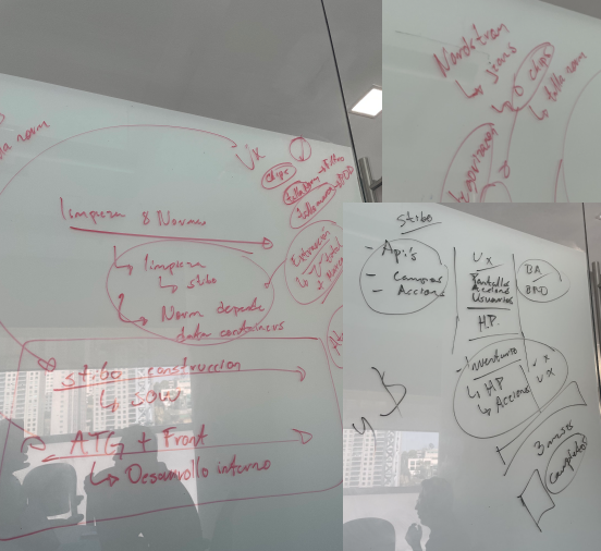
Mapping the solution
Together with Business Intelligence team, we made a list of features the business needed and we added some of the things we thought would help the user. I brainstormed with engineering, stakeholders, AI team, product governance and all other teams involved and arrived into this plan that was viable and achievable.
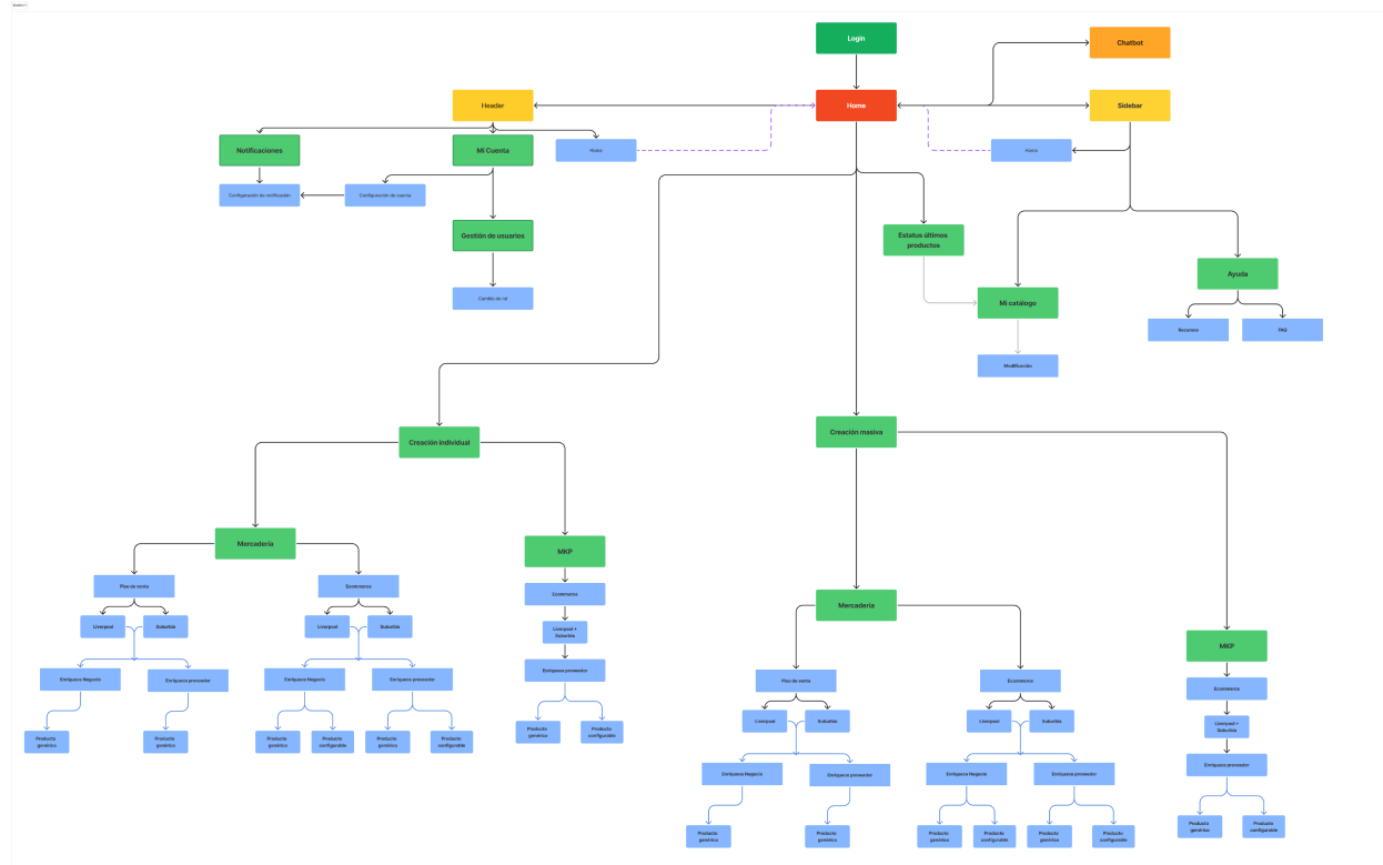
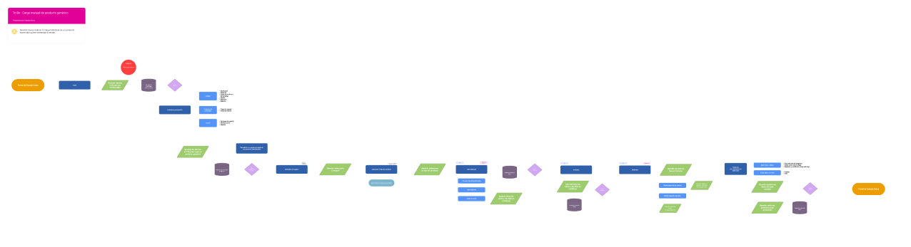
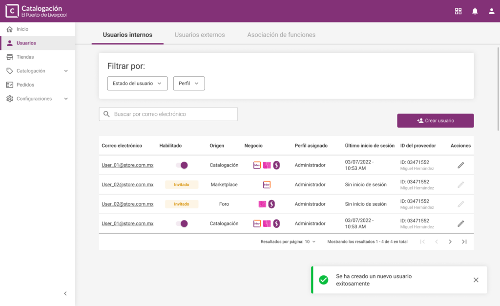
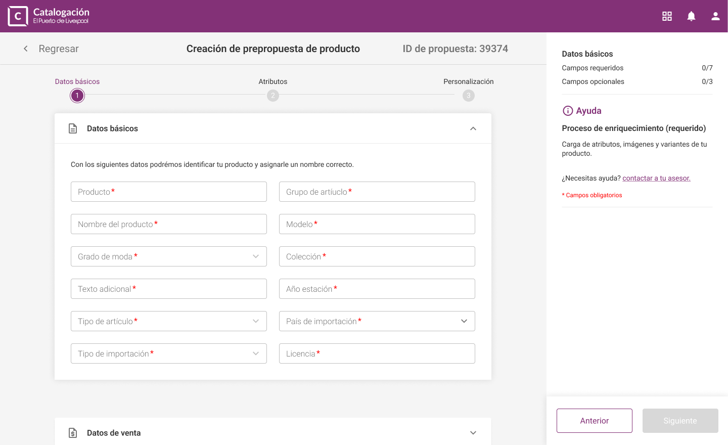
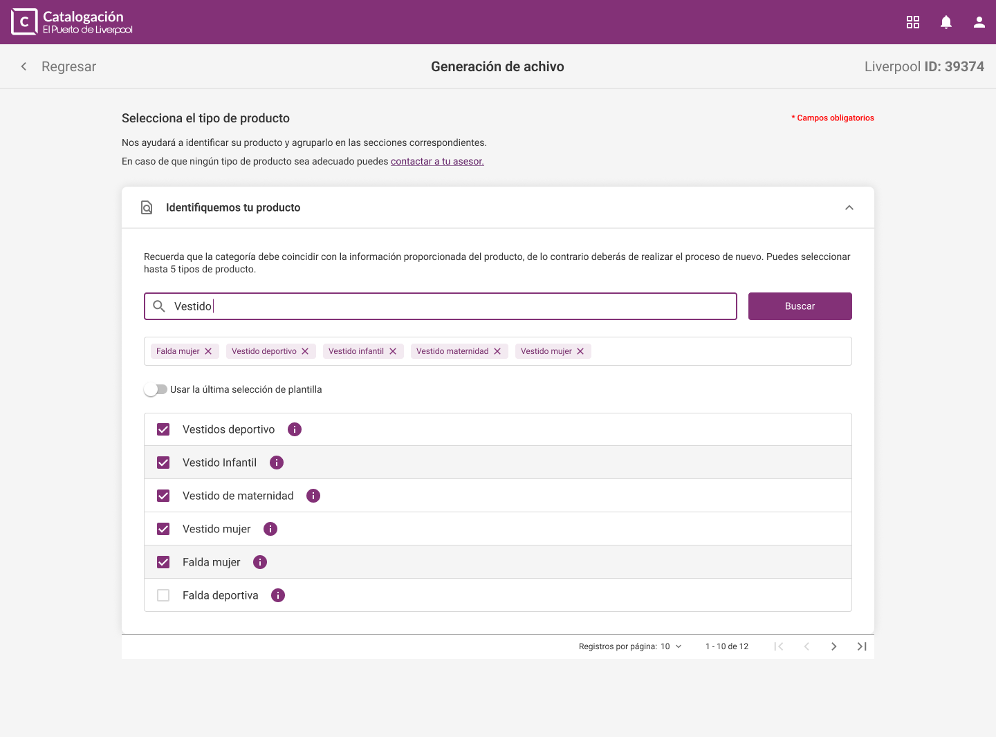
The process was complex. The user needed to have a defined role as it was important to separate internal users and external vendors. That meant the first module is going to be User Management. The main objective of the workflow is to catalogue a product, that means, selecting a template, adding basic, sale, logistics and variant data and finally: adding images, videos and multimedia. This could be done in one of two possible ways: Individual creation and massive creation. If the user wanted to create a product manually, the workflow needed to be as clear and helpful as possible. I decided to create a «holding hand» approach, that meant, always having relevant information and clear instructions available to the user. On the other hand, if the user wanted to make a massive creation, we needed to be as efficient as possible without making it harder. With these two objectives in mind I made the following roadmap with prioritization of the most important features
Chapter Two
Robust user management
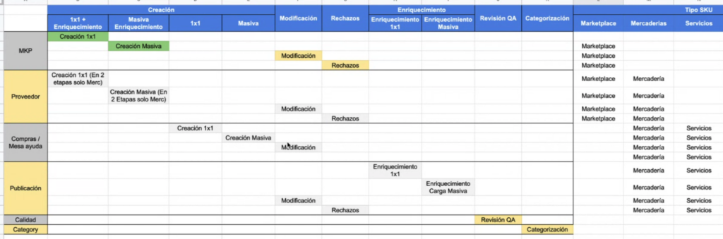
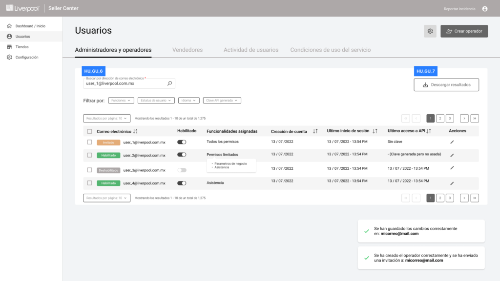
If Entrada Única was to become the solution we hoped for, a robust user management module was needed. I started by mapping every module we had and the different users that needed access to them

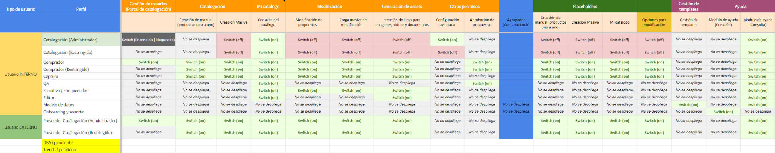
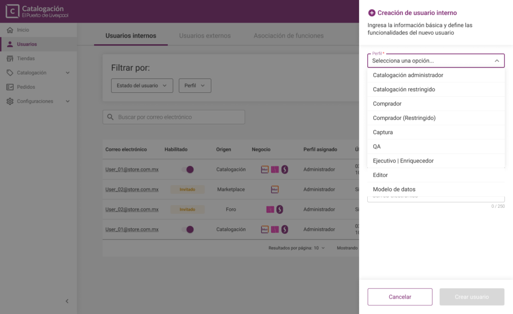
After mapping the problem in a matrix like this one, I moved into designing a user-centered solution. I started by defining user types: internal users (Liverpool employees) and external users (vendors and service providers). From there, I introduced a role-based access system, ensuring users were assigned roles according to their responsibilities. These roles followed a clear hierarchy—from full-access admins to highly restricted users.
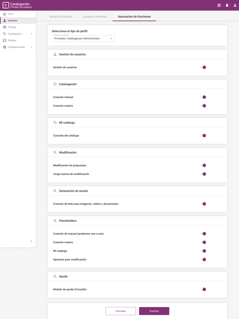
To give teams more flexibility and control, I designed a feature called “Asignación de funciones”, focused on intuitive permission management. This interface allowed administrators to easily view, assign, and adjust granular permissions per role, tailored to each system module. By designing this system with usability in mind, I aimed to reduce complexity and empower users to manage access without relying on technical support.
Sketching the solution
First we thought of a layout and realized we stumbled into a complication. There was too much information on the screen at all times. Thats when I came up with a concept and personal design philosophy for this project: Deus ex sidebar. This was a personal joke that came to be when we came up with the idea of using a contextual sidebar that would guide the user and give clear feedback (tackling one of the mayor pain points users had). Then it evolved into conditioning the user to always look at the sidebar if he needed instructions. This sidebar became our most important resource.
With the first wireframes I began finding a layout that worked.
After many iterations we arrived at this layout rules:
Final feature set
Along with AI and Engineering teams we came up with a solution of a AI bot that would give a preliminary validation and give feedback on simple errors to the user so they can fix them before sending the proposal and thus, reducing lead time from 20 days to around 7 days. Other new features included:
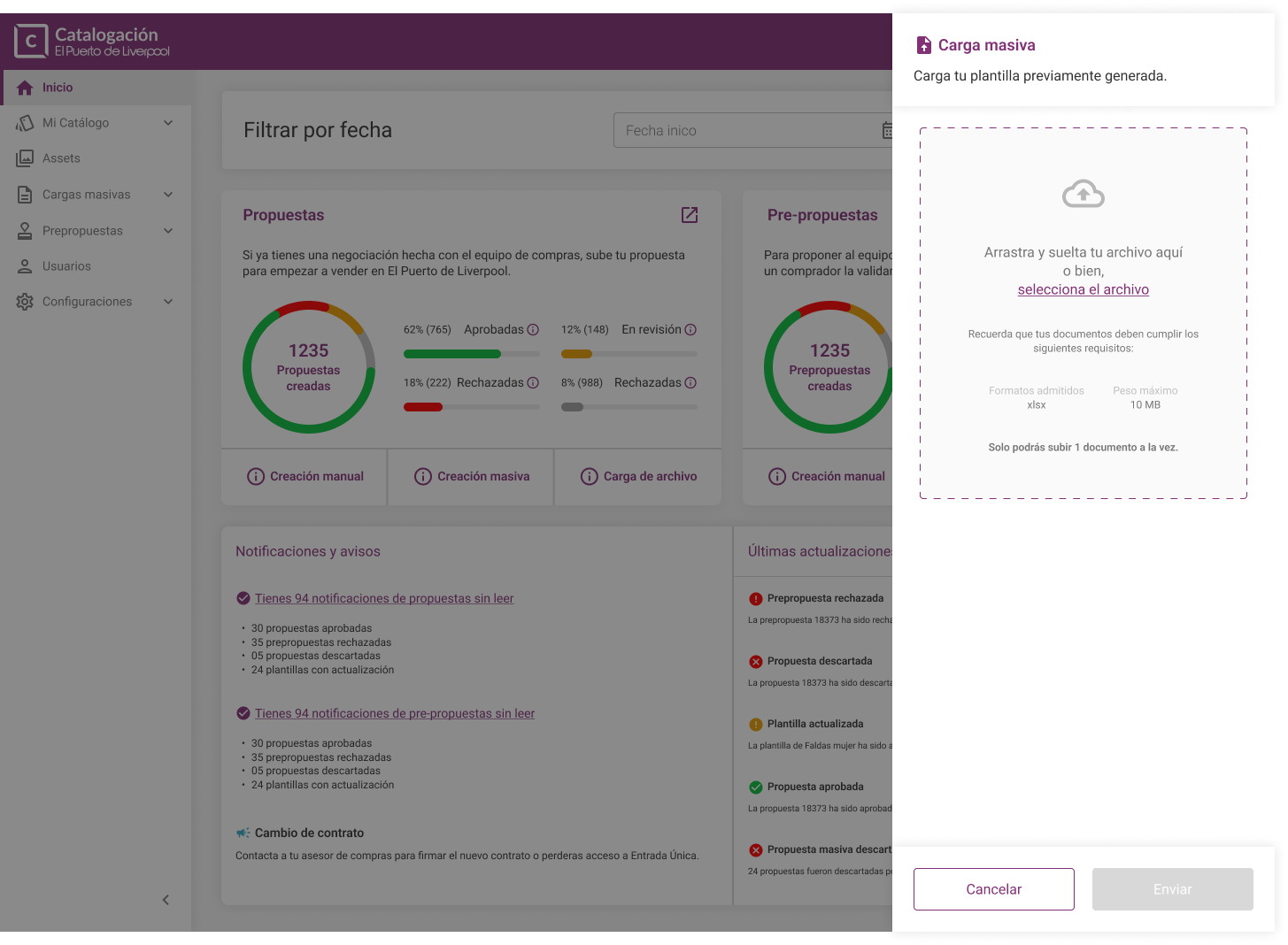
- A storage bucket that allowed users to upload all their images at once, then another AI bot that cropped the image to the right size and format and a system that would link this images to the correct proposal.
- A validation tool that sends clear feedback when someone from the team rejects a proposal.
- A notification system that would automatically group individual notifications into status reports.
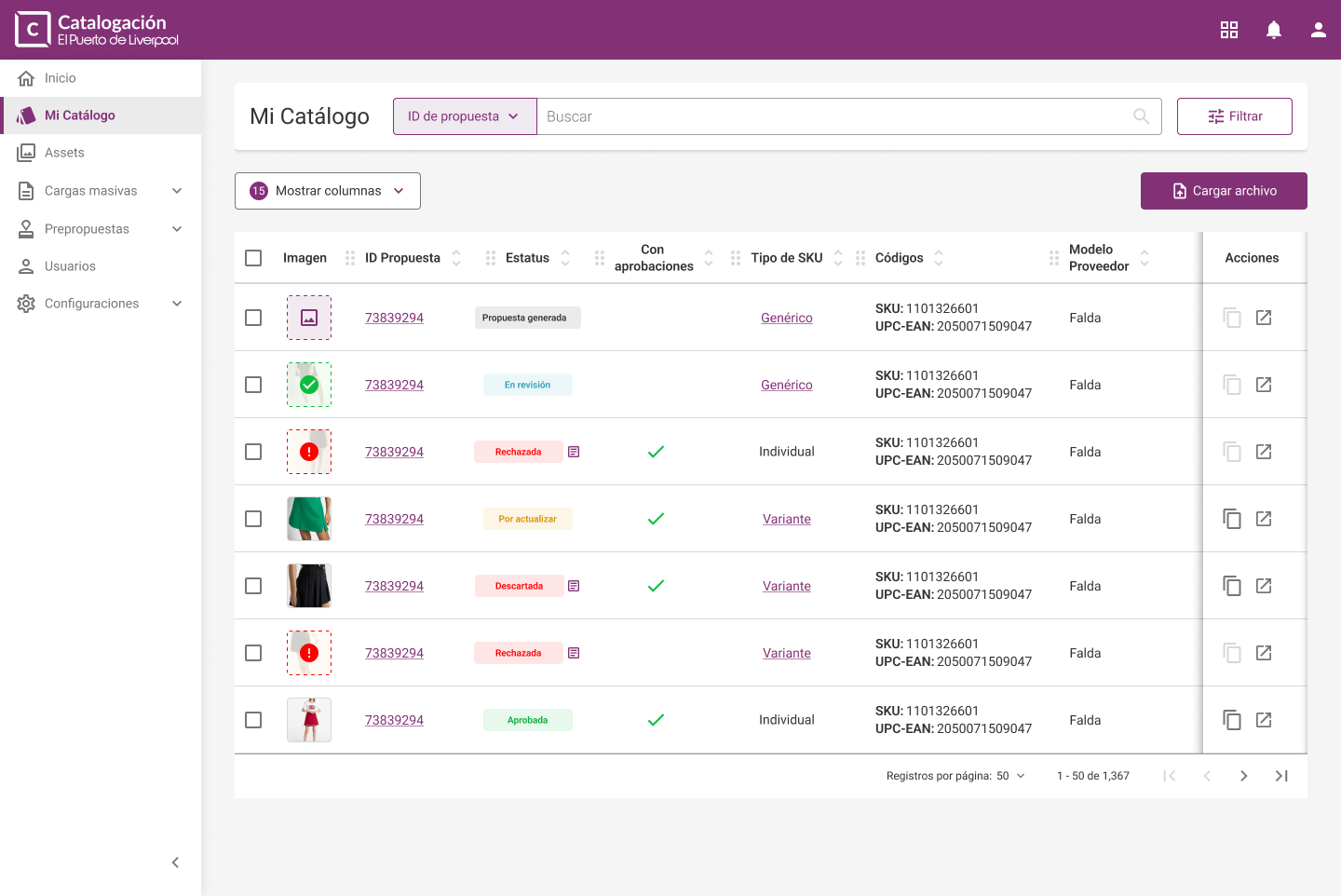
- A new catalog view that allowed users to see all of their progress.
- A manual product catalog flow and a massive upload option that allows the user to upload an Excel file and do as many as 50,000 products at the same time.
High fidelity screens
With all the features defined and a clear design identity I began doing a UI Kit based on the global design system, but adapting it to the global brand and desktop layouts. I made components for elements such as step counter, data tables, inputs, popups, notifications and many more elements.

Results
The prototype was a success and got approved by leadership. We spent the next six months completing every feature and the product is almost ready to ship, just some of the backend work is missing.
Chapter Three
Expanding the idea
With the huge internal success that this project was, the CEO decided that he wanted that same centralization philosophy applied to as many business areas as possible. The Cataloguing portal was called “Entrada Única” because it was meant to be the only portal you needed to do all cataloguing but now, it would take another meaning: A single portal that would contain all the tools our users needed. So he tasked my team to begin planning the most ambitious project the company ever had (in the software department).
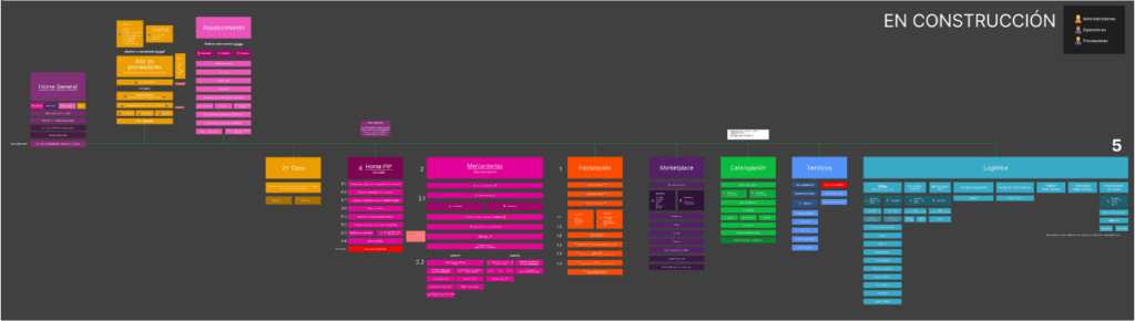
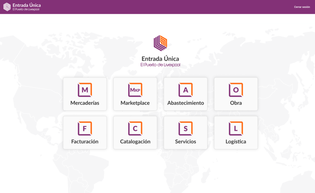
We mapped every tool, portal, process and feature we thought it was needed for day to day operations and began making an action plan to make a navigation that made sense. In the end, we opted for eight different, interconnected, portals that offered as many features as we needed with a single sign in:
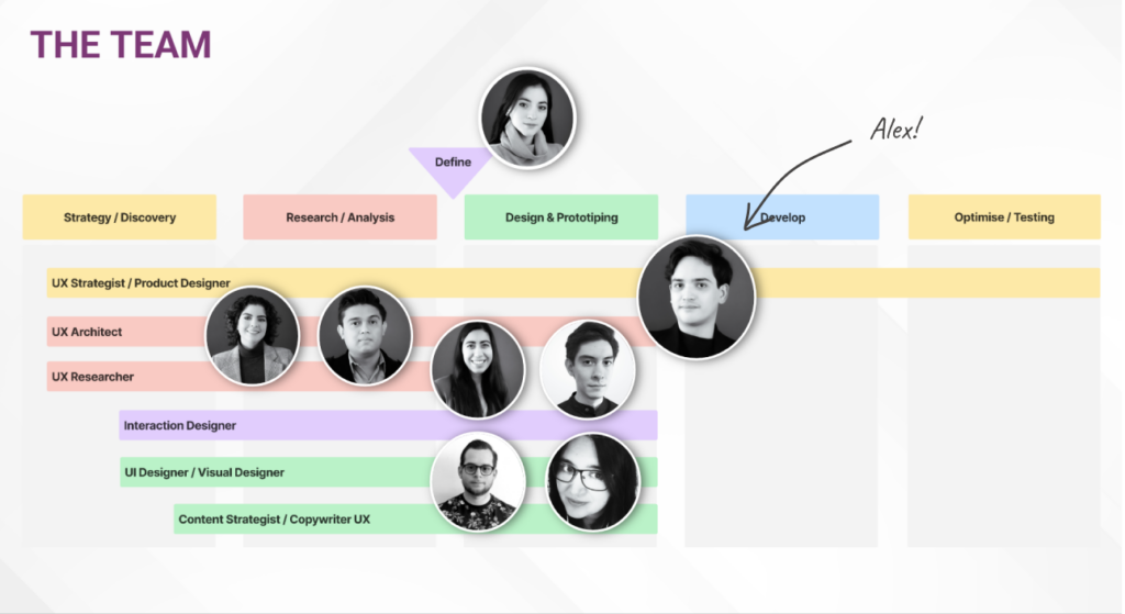
By this point my role had changed. I was made design lead of the Cataloguing project and took a team of three designers and supervised the creation of another three portals: Obra, Logística and Mercaderías. I served as a mentor to the new design team and help them plan the strategy of each implementation.
Today I serve as a product designer of the whole initiative. My role is to keep finding features that make sense within our framework and implement them on different portals and to supervise the construction of each. I am more of a support designer and more of a strategic partner to them.
Chapter Four
The future
As of 2025, Entrada Única is still on development. I will keep updating when new modules are released.
ABOUT ME
With a background in Digital Communications and a distant past as filmmaker, I blend my skills in design with effective storytelling to enhance both functionality and user satisfaction. My career has spanned designing SaaS and enterprise solutions, where I’ve tackled everything from admin dashboards to comprehensive workflow systems across various sectors including logistics, finance, and retail. Off the clock, I’m a technophile who loves exploring emerging technologies like AI and VR, always eager to see how they can transform our digital landscape. I thrive in environments that challenge my creativity and technical skills, and I am committed to pushing the boundaries of what’s possible in design to create solutions that not only look great but also work beautifully.